This post is about chapter six of Color and Light.
Here are all my thoughts and notes and such.
Monochromatic Color Scheme
Composed of any single hue taken through a range of value or chroma.
There’s a tradition for artwork made in grayish, brownish, or bluish tones.
Pencil drawings/anything made with one drawing tool–monochrome.
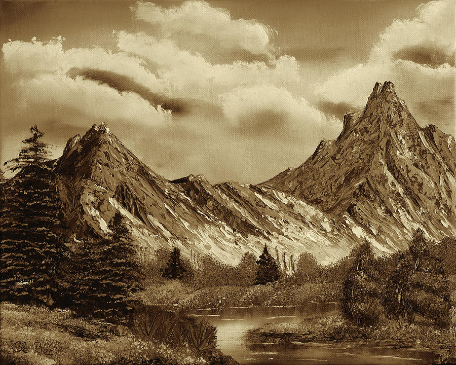
Grisaille-in gray. Often used as a preliminary step to plan tonal values before colors were overlaid in glazes. Here’s an example.


Monochrome draws attention–unique, understated. Suggest historical photos or flashbacks.
Warm and Cool
Idea of warm/cool colors is in our heads, but it has a real effect.
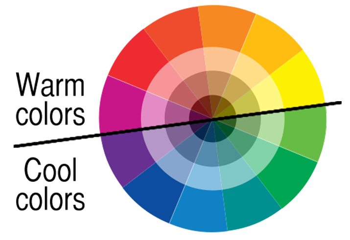
Warms range from yellow-greens to oranges and reds. Cools range from blue-greens to violets.
Cool colors evoke feelings of winter, night, sky, shadow, sleep, and ice.
Blue: quiet, rest, calm.
Warm colors bring feelings of fire, hot spices, blood, energy passion.
Orange and yellow are fleeting colors in nature.
Using all cools in a painting gives a feeling of mystery, darkness, or gloom.
Putting warm color next to cools adds interests.
Warms and cools can complement each other in grayed-down brown and blue-gray palettes.
Colored Light Interactions
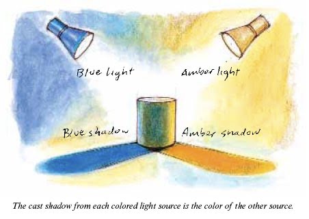
Additive color mixing–when two different colors of light shine on a form, creating a new color. It’s the blending of color in the eye.
Mixing two colored lights creates an area with a higher value than either light separately.
Green + Red = Yellow
If you have two light sources of different colors shining on the same form, the cast shadow from each light source will be the color of the other light source.
Triads
A triadic scheme is made up of any 3 basic colors (not necessarily full-chroma colors)
To use such a scheme, choose three colors. These are your tools. The colors should show up in different variations throughout the piece. You can put a few touches of other colors in, but try to stick to the three.
Question: I’ve always thought of triads as necessitating 3 colors equidistant on the color wheel, but that’s not what was described in the book… I guess you can do whatever you want, but having colors equidistant on the wheel is visually interesting.
Here’s what I’ve usually seen when talking about triads:

Color Accent
Adding a pop of color to a black-and white or gray image creates interest.
A color accent is a small area of color that’s very different from the rest of the piece.
A color accent can create the main focus of interest, but they can also be peppered throughout an image, adding relief from big areas of similar hue.
And that’s it, folks! 🙂
What a cool chapter. I am excited to try out the different techniques and make something awesome.