Color and Light: Premixing–Chapter 7

Mixing Color Strings

Color string–prepared paint blobs of a given hue mixed with a palette knife in steps from light to dark. It saves time when you’re painting observationally.

Advantages: It uses less palette surface than free mixing, you can mix generous batches with your palette knife (leaving your brush to be used just for paint application), and it saves times in the long run–you don’t have to keep remixing colors.

Mixing 4-5 value steps should be enough to get the values you need. Have 2-3 light steps, 2-3 shadow steps and blend anything else you need.

Gamut Mapping

Entire group of possible colors for a painting: gamut. (Polygon superimposed over color wheel.) The colors you use in a composition are as important as the colors you leave out.

Image result for gamut mapping

Composed of subjective primaries (corners), subjective neutrals (the mixture midway between all extremes).

The secondaries of a triadic gamut will be lower in chroma than the primaries. (Halfway point along each side of the triangle is closer to the gray center–more neutral.) This is called saturation cost.

Creating Gamut Masks:

Cut a mask of a gamut shape and place it atop a color wheel. Move it around to create new schemes.

You can choose exactly what colors you want. You can invent and preview different schemes you might not have considered. You’ll have what you need to create a color scheme, and it looks awesome.

Shapes of Color Schemes

Gamuts are polygons. Can be triangles, diamonds, or squares. Triangles are most common shape. Useful one: equilateral triangle shifted to one side of the wheel without overlapping the center at all–an atmospheric triad

Image result for atmospheric triad

Complementary gamut–long diamond stretching across the middle of the wheel.

Mood and accent scheme–most of piece in one part of environment with a separate shape in a complementary color for accent.

Mixing a Controlled Gamut

choose your color, and then make color strings that you’ll use for your entire painting. Premixing helps you stay within your gamut.

Once you’ve mixed your colors and made your strings, remove the tube colors from your palette–they’re not in your gamut.

Color Scripting

In sequential art (like a movie, illustrated book, graphic novel), no color scheme stands alone. Everything needs to flow with what’s around it.

You can plan your color script with the aid of a color wheel and gamut masks. A sudden gamut change signals a change to the audience.

Image result for color scriptingHere’s color scripting for the movie “Cloudy With A Chance of Meatballs.”

Color and Light: Paint and Pigments (Chapter 5)

Warm Underpainting:

Paint underneath the painting with a wash of a warm color….

It forces you to cover the background with opaques, forcing you to make mixing decisions.

Most helpful for blue/green paintings–the warm bits peeking through make the greens/blues sparkle.

Image result for warm underpainting

Sky Panels:

Sky panel is a surface prepared with a sky gradation as a base layer for future painting. (Basically, you paint the sky first, and then come back later to paint everything else once the sky is dried.)

Helpful for describing intricate details against a light sky, and when your chief interest is the complex, middle-ground tracery.

You can prepare backgrounds in advance because clear skies are fairly standard and predictable.

Limited Palettes

Go on a color diet! It leads to a more harmonious effect.

This painting was made with only titanium white, pyrrole red, ultramarine blue, and burnt sienna.

3 reasons to do this:

more harmonious, it forces you out of color-mixing habits, and they’re compact and portable.

Make color wheel tests to preview the range of possibilities with a limited palette. Try using one full-chroma color with two weaker colors from across the center of the spectrum.

The Mud Debate

“Beware of Mud”

Some only use primary pigments laid over each other to transparently achieve all other colors. “Overmixing makes color muddy sometimes, especially when more than three colors are used.”

“Mud is a Myth”

Others say there’s no such thing as a muddy color mixture. Either you’ve mixed the right color or you haven’t. The dullness/muddiness comes from poor value organization. It doesn’t matter how you come to achieve a mixture.

Gurney’s opinion: more paintings suffer from the “fruit salad disease” of too much pure color rather than from murky mud. The cure for either problem is good value organization–good planning.

Color and Light Chapters 10 & 11

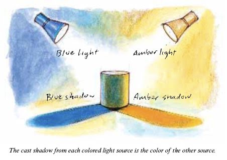
Chapter 10–Atmospheric Effects

Sky Blue

The sky gets lighter near the sun–solar glare.

The sky shifts in value from zenith to horizon. It gets darker as you go up.

The sky color changes in value, hue, and chroma.

Sky color is lighter and warmer near the sun–more white light is scattered there.

When mixing sky colors, shift your mixtures from top to bottom and from side to side.

Atmospheric Perspective

Image result for atmospheric perspective

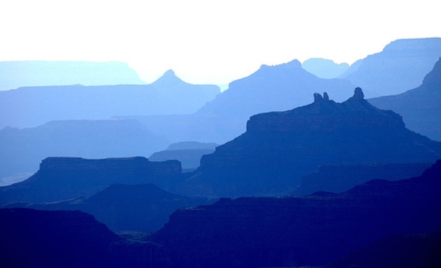
Darkest areas are affected first, becoming lighter and bluer.

Illuminated sides of objects lose color saturation, becoming grayer as they go back.

Warm colors grow duller and cooler.

Contrast between light/shadow sides of objects reduce until everything is flattened into silhouette.

Things look blurrier.

White objects grow warmer as they go further away, like the sun and clouds and such. White objects are visible for the longest amount of time at a distance.

Atmospheric perspective only happens if the thing is illuminated.

It’s more intense when there’s dust, moisture, haze, or smog.

Reverse Atmospheric Perspective

Image result for reverse atmospheric perspective

When there’s vapor or dust or clouds by the sun, atmospheric perspective is reversed and things get warmer as they go back.

Relatively rare, brings a feeling of strangeness or excitement.

Golden Hour Lighting


Dawn and Dusk–colors become bold and dramatic.Sunlight travels through more miles of atmosphere at this angle. The sky is a richer blue. The remaining sunlight is weaker in brightness and more orange and red in color. Forms lit by this light are golden and shadows are very blue.

Sunsets

Don’t show up well in photos, but good to paint from observation.

Many colors–sun interacts with dust, air, and clouds. More moisture and dust–more reds and yellows. Brightest red-orange from where the sun crosses the horizon.

Weaker light glow at antisolar point–opposite of the sun.

Warm colors drain out, leaving violet.

Reverse colors in the morning.

Fog, Mist, Smoke, Dust

Contrast drops off rapidly as forms recede. The sun can’t penetrate far, so light reaching the ground seems to come from everywhere.

Rainbows

Have cool symbolic meaning.

Rainbows don’t exist in a particular geographic space, but as an angle in relation to the viewer.

Antisolar point is the center of the rainbow. All shadows in the scene should orient toward that point.

Secondary rainbow–reversed color sequence, weaker. Between rainbows is a darker band–looks darker because of additional light reflected.

Colors of rainbow should always be lighter than background.

Skyholes and Foliage

Silhouette of tree is almost never solid. Smaller skyholes should be painted a little darker than the sky–often contain a network of fine branches and tiny leaves. Make the skyholes various sizes and give them a ragged character.

Foliage has different degrees of transparency.Spring leaves only partially block sky. Get darker in the summer. Different kinds of trees are more ore less opaque and have different numbers of skyholes.

Sunbeams and Shadowbeams

Sunbeams occur in these conditions:

–high screen of clouds, foliage, or architecture is punctuated by a few openings. Perforated layer needs to block most of the light to allow a darker backdrop against which the sunbeams can be seen.

–air is filled with dust, vapor, smoke, or smog

–view is toward the sun–beams are nearly invisible when you’re looking away from light source.

Could see these things in a variety of places.

Edges of beam get more fuzzy as they go away from light source.

Sunbeam influences shadow values of the forms even more than they affect light-side values.

Shadowbeams are rare. Occur when a jet contrail aligns with the line of sight.

Dappled Light

Image result for dappled light painting

Spaces in a tree create little pinhole projectors. Projections of circular shape of the sun.

Higher tree canopy makes bigger circles with softer edges.

Cloud Shadows

Image result for cloud shadows

Use cloud shadows to control a viewer’s attention.

Dutch landscape painters frequently used this method–adds interest to a flat landscape.

Illuminated objects attract attention when there’s a lot of shadow, and vice versa.

Three rules:

–margin between light and dark needs to be a soft edge (about half a city block in size).

–size and spacing of cloud shadows needs to match the clouds visible in the sky.

–shadow area is darker and cooler than the sunlit area. Shadow doesn’t have as much of a blue cast as the cast shadows on a clear day.

Illuminated Foreground

Kind of unusual setup, where the foreground is bright and the middle distance is in shadow. (Usually, the foreground is shadowed.) Can concentrate attention on the foreground.

Snow and Ice

Snow is denser and whiter than clouds or foam. It picks up the colors of whatever is around it, especially in shadow. Shadows–color of the sky.

Has a lot of subsurface scattering, especially when it’s newly fallen.

Older snow is darker and shinier. Water appears darker next to snow since snow is so white.

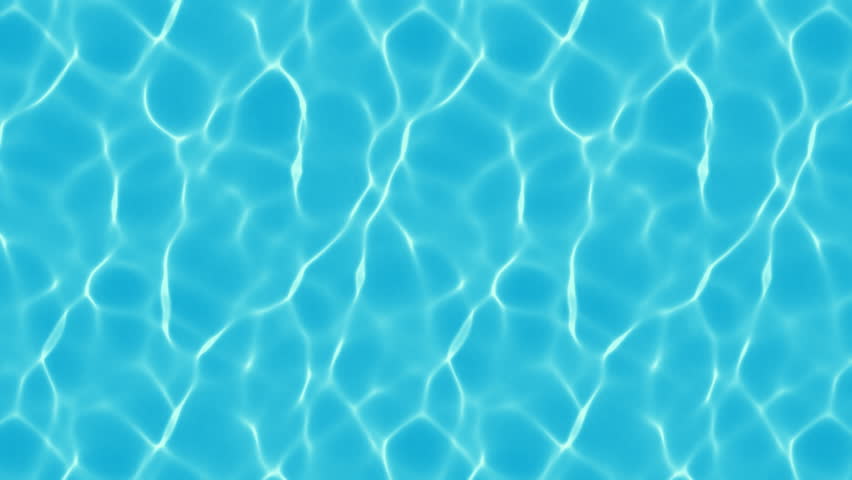
Water: Reflection and Transparency

Reflection and Refraction

Water is only as reflective as a mirror when you look straight across it at a shallow angle. Steeper angle—more light entering water.

When you look straight down–water looks darker, not much light reflects from the sky.

Water is more transparent when it’s nearer to you.

Reflection of dark objects is affected by the amount of sediment in the water and the amount of light shining in the water.

Dirty water that’s illuminated makes the darks turn lighter and browner. When there’s no direct light touching the water, muddy water reflects as well as clean water.

Vertical lines are preserved in reflections, while the horizontal lines are broken by the water’s uneven surface.

You can’t cast a shadow over deep, clean water.

If you do get a shadow–in silty water–it will have diffuse edges.

Mountain Streams

Stones in water shift to darker, warmer versions of the local color of the rock.

Deeper than 3 feet, colors get bluer and the bottom surface gets less distinct.

Details on the bottom are distorted by the ripping surface. Paint loosely.

Shallows–warmer colors. Colors shift to blue/green in deeper pools.

Color Underwater

Water filters out colors of light.

Red is gone by 10 feet

Orange and yellow are gone by 25 feet.

Blues and violets are all that remain. Only violet and ultraviolet light exist at the deepest depths.

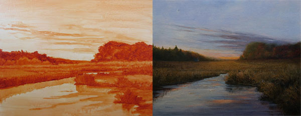
Here’s a picture that shows the same scene with and without color correction (as if the colors could show underwater further).

Image result for color underwater


Chapter 11: Light’s Changing Shadow

Serial Painting

Image result for serial painting

Serial painting is making multiple plein-air studies of the same subject under different conditions

Try storyboarding your day! Make little studies of landscapes as you pass on a train or scenes from your life. Watch how the light changes.

When serial painting, keep the drawing consistent so the only variable is the light.

Don’t look at previous studies as you paint. Try painting at different times of day and different seasons of the year

Try to find a spot to paint that has different eleents in it, like mountains, a house or other planes facing different directions, etc. Give yourself stuff to work with!
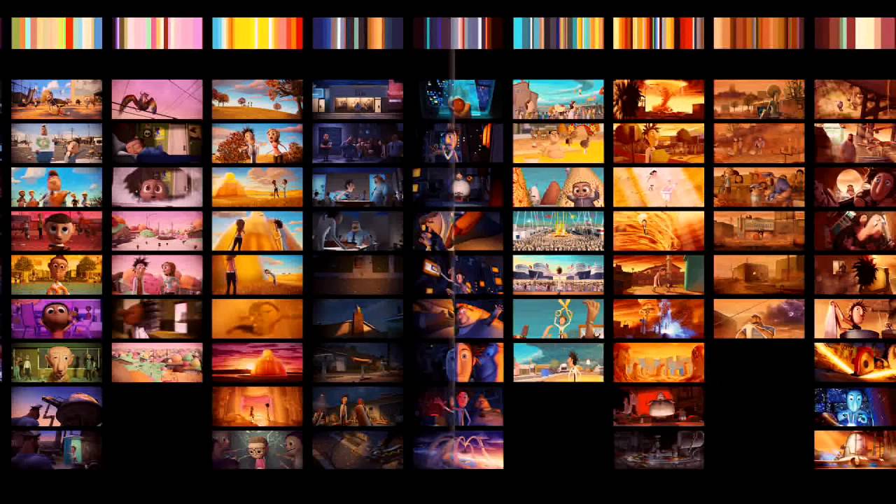


Color and Light Chapter 9–Surfaces and Effects

Transmitted Light:

When sunlight travels through sin, semitransparent material, the light becomes colored.

4 distinct foliage colors: transmitted light, downfacing shadow, upfacing shadow, and toplit with sun.

Subsurface Scattering:

Lit enters translucent materials (like skin) and spreads out, creating a glow. It affects forms with depth and volume.

Most dramatic when you’ve got translucent flesh, small forms, and backlighting.

It makes people’s ears look red when backlit and makes the edges of fingers red when held against the sun.

Image result for subsurface lighting

Color Zones of the Face

Image result for color zones of the face

The differences between the zones of the face are very subtle. More pronounced in men than in women.

More capillaries in the middle region, hence the reddish hue. Fewer veins in the forehead. Stubble and blue-toned veins in the bottom third.

The Hair Secret

To make hair look pretty, don’t draw each individual strand–use big brushes, keep masses simple, soften edges, and control highlights.

Where the hair meets the forehead, look for variations and don’t allow the edges to be too hard.

Visualize masses of hair as ribbons–the highlight goes across (NOT ALONG) the curving shapes.

Short or pulled-back hair creates a highlight that extends across the entire head.

Key light and an edge light can make hair interesting. No set formula for hair because it can be so different for different people.

Caustics

Image result for caustics

Water in a glass or light going through waves creates a lens which focuses light into spots or lines of light.

From transparent objects, the light bunches up and forms lines of concentration along the boundary of geometric shapes.

Underwater caustics create shapes on the backs of fish or on the sea floor, but they don’t occur much deeper than 20-30 feet. They only happen on sunny days as well.

Caustic reflections can be cast upward from wavelets–you could see them on the underside of a bridge, for example. They can also appear inside concave shiny objects, like cubs or bowls.

Specular Reflections

Shiny objects act like mirrors, reflecting whatever’s around.

specular reflection: light rays bounce off the surface at the same relative angle that they approached it

diffuse reflection:  light rays bounce in all direction–typical of a matte surface.

Many objects are a mix of the two…

3 Rules of Specularity:

–The more reflective the surface, the broader the range of values you need to paint it.

–Convex reflective surfaces, such as chrome, reflect a mini view of the scene around the object, often including elements beyond the limits of your composition.

–Specular pattern is a separate layer added on top of the usual modeling factors you use to render the object. (Consider normal modeling factors PLUS specular efffects.)

Highlights

Specular reflections of the light source on wet or shiny surfaces.

Highlights are a combination of the color of the source and the local color of the object.

Annular highlights–like scratches in a metal surface, cobwebs, tree branches catching sunlight.

Color Corona

Surrounds a very bright source, like a setting sun or streetlight. (Called a lens flare in photography.) It’s a region of colorful light, like a halo. Glow takes on the native color of the source. It’s cool because it can make a source seem brighter than the white of the paper, and it can make the viewer squint involuntarily.

Motion Blur

Motion blur–form moves rapidly in front of a stationary observer or camera.

The faster an object is moving, the more it’s blurred. Blur is greatest in relation to the path of the movement.

Speed blur–camera tracks along with a fast-moving object.

Background blurs radially from the vanishing point along the path of movement. Forms closest to the camera blur the most.

Photos vs Observation

Cameras tend to distort light and color. Here’s how things change:

  1. Deep shadows look black and highlights look white.
  2. Colors shift/weaken in chroma. Subtle variations between adjacent warm and cool colors are often lost.
  3. Weak sources, like reflected colors from nearby objects, are lost.

How to use photos without losing color:

  1. Use your chosen medium to make a color note while on site.
  2. Turn reference photos into black and white images so you won’t be influenced by photographic color.
  3. Wait for overcast days when lights/darks aren’t so extreme or use a reflector.
  4. Take 2 exposures–one for lights and one for darks–and use the two photos for your reference.

Color and Light Chapter 3

Here are my notes! Enjoy 🙂

The Form Principle

Image result for sphere for drawing sunlight vs diffuse

Light hitting geometric forms, like spheres and cubes, creates an “orderly and predictable series of tones.”

2 Classic Lighting Conditions: Sunlight and Overcast

terminator: “bedbug line:–area where form transitions from light to shadow. Occurs where light rays from source are tangent to the edge of the form.

Shadow isn’t darkness, but effect of other weaker sources–blue light from the sky outside, reflected light bouncing up.

occlusion shadow:  darkest part of shadow, points of contact.

Core Shadow: helps define form. Only forms if secondary light source doesn’t overlap too much with main light.

COOL IDEA FOR SIMPLIFYING COMPLEX FORMS: Group planes that are similar together.

Texture is difficult to see in shadow regions. Best seen in darker halftones before the terminator (half-light).

Diffuse Light (like an overcast sky) doesn’t give a distinct light/shadow/terminator/core. Upward-facing planes are lighter.

Separation of Light and Shadow

Image result for checkerboard illusion

Light/Dark sides of a form can be separated by as many as 5 steps on the tonal scale.

In bright sunlight, a newspaper in shadow is darker than a black shirt in the light.

Cast Shadows

Cast shadows can add depth or tie elements together in your composition.

On sunny days, shadows are more blue (reflect blue of sky). On cloudy days, the light above is more white, and sometimes other light sources dominate the color of the shadow.

Soft light–casts shadows with blurry edges. Hard light–casts shadows with sharper edges. Two lights side-by-side cast two shadows. Edge of shadow gets softer s the distance increases from the object that cast the shadow.

Half Shadow

To create drama (works well with vertical forms), light the top half and leave the rest in shadow.

Image result for half shadow painting

Occlusion Shadows

When forms come really close together, they crowd out the light and leave a small, dense area of shadow. Also known as crevice shadows.

Three-Quarter Lighting

On a face, a light coming from 45 degrees in front of the model allows both eyes to be lit. A shadow is cast by the nose onto the cheek, and there’s a triangle on the shadow side of the face that remains lit.

Different angles of 3/4 lighting can be used. They’re flattering and commonly used by artists.

Frontal Lighting

This kind of lighting emphasizes 2-D design instead of form. It’s good lighting if you want to emphasize local color or pattern–featuring a fashion or costume, for example. One of the few times when outlines appear in real life. Outlines are actually shadows right on the edge of the form.

Edge Lighting

Come from behind to touch sides of a form. Separates the form from the background. Called rim light or kicker as well. Usually need a strong light source.

When the sun is low in the sky, it can cause that.

Width of rim light varies according to the size of the planes that face backward into the light. Edge light isn’t just a line around the form. Broadest planes create the widest part of the rim light.

Contre Jour

Backlighting where the subject blocks the light source. The field of light takes on an active presence, surrounding or infusing the edges of the object. Silhouette shape becomes prominent. Colors lose saturation and shadows stretch forward. Details disappear around the edge of the form. It’s a good idea to keep a little color int background haze.

Image result for contre jour lighting painting

Light from Below

Attention-grabbing because it’s rare. Can have a magical, dramatic, or sinister feel–often seen with firelight or in theaters. We usually see people lit from above, so it can be hard to recognize people lit from below. Often a colored light, like fire or a computer screen.

Reflected Light

Every object that receives strong light becomes a light source, and it will affect any nearby area of shadow.

Some truths:

  1. In shadows, upfacing planes are cool, and downfacing planes are warm.
  2. Reflected light falls off quickly as you get farther from the source, unless the source is very large (such as a lawn).
  3. The effect is clearest if you remove other sources of reflected and fill light.
  4. The color of the shadow is the sum of all the sources of reflected illumination, combined with the local color of the object itself.
  5. On a sunny day, vertical surfaces in shadow usually receive two sources of illumination: warm ground light and blue sky light.

Spotlighting

Concentrates the viewer’s focus on a person or thing. Theatrical feeling. Used in night scenes.

Limitations of the Form Principle

Materials like clouds, leaves, hair, glass, and metal don’t react the same way to light as more solid objects. It’s hard to make general rules.

For clouds, you can say this, at least: they transmit a greater quantity of light to the shadow side through internal scattering than the volume of light they pick up from secondary sources.

Remember that the world isn’t made of plaster. It’s made out of all kinds of materials that need to be dealt with on an individual basis.

Color and Light Chapters 8 and 4 Notes

CHAPTER 8

Color is important. It gives “emotional flavor.”

The color of moonlight

Image result for moonlit paintings

Moonlight is usually painted with a bluish or greenish cast, while it is technically more red than sunlight. What’s up with that?

In dimmer light, blue green hues appear lighter in tone–the Purkinje shift

Image result for purkinje effect

To effectively paint night scenes, one must train the memory and imagination–can’t really plein-air paint by moonlight, and cameras don’t see things the same way.

Depth of Field

Image result for depth of field

Basically, blur out the background information. When painting, we can focus on every object and make everything have crisp, distinct edges, but that’s not what’s done in photos. It can help draw our attention to what’s most important.

Intersecting Contours

When things overlap, how do you show depth? Blur some edges, leave others crisp. Depending on how you do that, different things will stand out in your image, and a different story will be told.

Painting in Moonlight

Our eyes can’t see well in dim light–we don’t see details like blades of grass or cracks in the sidewalk. Be careful when painting from photo reference–photos can see things the eye won’t see.

Color Constancy

As humans, we don’t see color objectively. Our view of color is very subjective, and we use context clues to figure out what color things are in relation to other things

Image result for color constancy

The two squares with the arrows are actually the same color, though they look very different because of what’s around them.

To try to see colors more accurately, isolate them–look through a hole in a card or through a half-clenched fist.

In imaginative painting, you’ll have to learn how to make things look right by understanding the color of the light source and color of the object, and how they interact.

Successive Contrast: When you look at an object of a certain color, your eyes adjust to that color. The resulting afterimage affects what you look at next–this means that a few areas of complementary color can help enliven a color scheme

Colored Illumination Effects: Reflected light of a different color (0n shadow side) can make the light side appear a different color. We don’t see colors objectively.

Cool Light, Warm Shadows

Five Factors affect the appearance of colors:

  1. Simultaneous Contrast: Hue/color/saturation/brightness of a background color can induce opposite qualities in an object sitting in front of it.
  2. Successive Contrast: Looking at one color changes the next color we see.
  3. Chromatic Adaptation: Our visual system becomes adjusted to a given color of illumination. When illumination changes in color temperature, the sensitivity of color receptors changes in relative proportion, resulting in a balanced impression of color and light levels.
  4. Color Constancy: Local colors appear consistent, regardless of lighting circumstances that change their hue/color/saturation.
  5. Size of the Object: Smaller objects appear to have less distinct color.

When painting, COMPARE colors to each other to figure out what they should look like. Compare to a white and black, to a same-value gray, and to a full-chroma version of a hue.

CHAPTER 4

So, you think red, yellow, and blue are the primary colors?

Ha.

Nothing is as simple as it may at first seem. There are lots of different color wheels, and lots of different theories about color. There is red/green/blue of light, CMYK of printing, and lots of other ideas about what the primaries actually are.

Here’s the Yurmby color wheel

Image result for yurmby color wheel

Red Blue and Green are separated by Magenta, Cyan, and Yellow (all are equidistant on the wheel).

Each color is defined by its HUE (where it is around the edge of the color wheel) and its CHROMA (how pure or grayed-out it is).

Peak Chroma Value (see photo above). Yellow is at its highest chroma in lighter colors. Red in the middle values, and blue in the darker.

Local color: Color of the surface of an object as it appears close up in white light. The color you actually mix will usually be different from the local color.

Grays are an artist’s best friend.

“Better gray than garish.” –Dominique Ingres

Try mixing grays from complementary pairs, and use those pairs in the painting as well.

There is no single gray color. Don’t be afraid of grays.

GREEN is a struggle for many artists. It can look weird.

Some tips:

You can get rid of green pigments–make them from mixing blues and yellows. They’ll be weaker and more varied (that’s better).

Avoid monotony–vary your green mixtures.

Use a pink or reddish gray with the greens. “Smuggling reds.”

Prime canvas with pinks/reds so they’ll show through and enliven the greens.

Creating good gradation takes careful color mixing and has a great effect. “Nature will not have one line nor color, nor one portion nor atom of space without a change in it. There is not one of her shadows, tints, or hues that is not in a state of perpetual variation.” — John Ruskin

Here’s some gradation from Ruskin himself:

Image result for john ruskin paintings

Tints–add white to make a pastel colors. Offset these with darker values in other areas of the painting for contrast.

2 ways to make tints: add white (makes it more bluish) or add it in a glaze.

Color and Light: Color Relationships

This post is about chapter six of Color and Light.

Here are all my thoughts and notes and such.

Monochromatic Color Scheme

Composed of any single hue taken through a range of value or chroma.

There’s a tradition for artwork made in grayish, brownish, or bluish tones.

Pencil drawings/anything made with one drawing tool–monochrome.

Grisaille-in gray.  Often used as a preliminary step to plan tonal values before colors were overlaid in glazes. Here’s an example.

Image result for grisaille art definitionImage result for grisaille art definition


Monochrome draws attention–unique, understated. Suggest historical photos or flashbacks.

Image result for sepia painting


Warm and Cool

Idea of warm/cool colors is in our heads, but it has a real effect.

Image result for warm colors vs cool colors

Warms range from yellow-greens to oranges and reds. Cools range from blue-greens to violets.

Cool colors evoke feelings of winter, night, sky, shadow, sleep, and ice.

Blue: quiet, rest, calm.

Warm colors bring feelings of fire, hot spices, blood, energy passion.

Orange and yellow are fleeting colors in nature.

Using all cools in a painting gives a feeling of mystery, darkness, or gloom.

Putting warm color next to cools adds interests.

Warms and cools can complement each other in grayed-down brown and blue-gray palettes.

Colored Light Interactions

Additive color mixing–when two different colors of light shine on a form, creating a new color. It’s the blending of color in the eye.

Mixing two colored lights creates an area with a higher value than either light separately.

Green + Red = Yellow

If you have two light sources of different colors shining on the same form, the cast shadow from each light source will be the color of the other light source.

Image result for complementary shadow color

Triads

triadic scheme is made up of any 3 basic colors (not necessarily full-chroma colors)

To use such a scheme, choose three colors. These are your tools. The colors should show up in different variations throughout the piece. You can put a few touches of other colors in, but try to stick to the three.

Question: I’ve always thought of triads as necessitating 3 colors equidistant on the color wheel, but that’s not what was described in the book… I guess you can do whatever you want, but having colors equidistant on the wheel is visually interesting.

Here’s what I’ve usually seen when talking about triads:

Image result for triad color scheme

Color Accent

Adding a pop of color to a black-and white or gray image creates interest.

A color accent is a small area of color that’s very different from the rest of the piece.

A color accent can create the main focus of interest, but they can also be peppered throughout an image, adding relief from big areas of similar hue.

And that’s it, folks! 🙂

What a cool chapter. I am excited to try out the different techniques and make something awesome.

Color and Light Ch. 2 and more Robh Ruppel

COLOR AND LIGHT

Okay, so, chapter 2 of  Color and Light is awesome. It talks about the different sources of light and how they look and how they affect an image.

Outdoor light consists of 3 kinds. The primary light source is the sun, which is a direct light and casts dark shadows. There is also the more diffused all-over light from the sky, which is bluish. There is also reflected light that bounces up from the ground and has the color of the ground from which it bounced.

When it’s overcast, the light is more diffused, and so colors are actually more distinct and bright, and there are fewer harsh shadows and highlights. It’s the ideal outdoor light for artists and photographers.

Window light is usually bluish, and it creates contrast with warmer electric lights in a room. Sometimes, light is also bounced from the ground outside to the ceiling–it’s often green or orange, depending on the color of the ground from which it bounces.

Image result for window light gurney

Candlelight and firelight are yell0w-orange.

Fall-off: The brightness of any point-source illumination diminishes rapidly with distance, according to the inverse square law–the effect of light shining on a surface weakens at a rate comparable to square of the distance between source and surface. (At twice the distance, the light is 1/4 as bright because rays must cover 4 times the area. At 3 times the distance, the light is 1/9 as bright.)

Light-Fall-Off-between-models

Indoor Electric Light is defined by 3 characteristics: Relative brightness, hardness or softness, and color cast.

Relative Brightness: How bright is one source compared to another? Relative brightness depends on wattage, type of lamp, how close the subject is to the light, and how bright other lights are.

Hardness or Softness: Hard light comes from a sharp, small point, like the sun or a spotlight. It’s directional and dramatic, casting crisp shadows and bringing out surface texture and highlights. Soft light emanates from a wider area. It’s more flattering and reassuring. It’s softer, causes more gradual transitions, and it’s good for task lighting.

Color Cast: Color cast is the dominant wavelength of a light source. Incandescent lights are strongest in oranges and reds, and weak in blues. Fluorescent lights emphasize yellow-green.

Streetlights and night scenes were traditionally lit with two sources–the moon (a blue or gray color) and orange flame-based light. In the modern world, there are more colors. Night scenes look different to the eye than they do to the camera.

To learn about night illumination:

Take photos with a digital camera set on a night setting. Disable the white balance setting and take pictures of a color wheel under different streetlights, then compare the photos to see how the colors are skewed. Try some urban night painting (light your palette with a portable LED light). Collect photos showing cityscapes at night.

Luminescence is the light given off by some objects at cool temperatures. Luminescent colors often graduate from one hue to another. Blue-green colors are most common in the ocean because the wavelengths travel the farthest through the water. Paint a scene in darker tones, then add the luminescence in at the end.

Hidden light sources can add interest. The three ways to light a scene are with a visible light source, a source outside of the frame, or from within the scene, but from  a hidden source. Concealed light sources provide interest. Mixing and matching different light sources (from different locations and with different temperatures) adds interest to a piece.


GRAPHIC L.A.

“Draw now… judge later.” Just go for it. Remember the basic rules of composition. Create bold shapes. Try the 70/30 rule.

Put in the work at the start, and at every stage of the process so that you can create a successful image. (Don’t try to skip to the end, like Prince Humperdink, otherwise things might not go as you had planned.)

Find the 3 main shapes, 3 main values, 3 main levels. Look for the best, simplest arrangement of values and forms.

EXPLORE. Move elements around a bit. Experiment with shape, placement, and all that jazz.

“A curious, less tense mind makes better choices and observations.”


Graphic LA Post 2

Here are my notes on Robh Ruppel’s Graphic LA pages 39-57.


The effect of-the large mass… the overall, the aggregate… PERSPECTIVE is more important than the actual objects.”

I think this goes with the idea of working from general to specific. If you have a pleasing shape to your composition in general, it’s going to look cool.

Robh Ruppel talks about simplifying your designs into the fewest possible values, and this advice is paired with several images done on white paper with a black marker. You can still tell what’s going on in the images, and you don’t need all kinds of values. I think that’s a sign of a good composition–it can be broken down easily into really simple value areas, and still make sense.

Examples from my own master copies of Ruppel’s works:

Advice:

Think while you’re drawing: Is it looking the way I pictured it? How am I picturing it? Ask yourself over and over.

“Graphic in nature. Dimensional in execution.” What does that mean? Hmm. Perhaps its just talking about the fact that Ruppel breaks things down really graphically into values at first, and then he adds dimension as he works? I don’t know.

It’s awesome, regardless.