Color and Light Chapters 8 and 4 Notes

CHAPTER 8

Color is important. It gives “emotional flavor.”

The color of moonlight

Image result for moonlit paintings

Moonlight is usually painted with a bluish or greenish cast, while it is technically more red than sunlight. What’s up with that?

In dimmer light, blue green hues appear lighter in tone–the Purkinje shift

Image result for purkinje effect

To effectively paint night scenes, one must train the memory and imagination–can’t really plein-air paint by moonlight, and cameras don’t see things the same way.

Depth of Field

Image result for depth of field

Basically, blur out the background information. When painting, we can focus on every object and make everything have crisp, distinct edges, but that’s not what’s done in photos. It can help draw our attention to what’s most important.

Intersecting Contours

When things overlap, how do you show depth? Blur some edges, leave others crisp. Depending on how you do that, different things will stand out in your image, and a different story will be told.

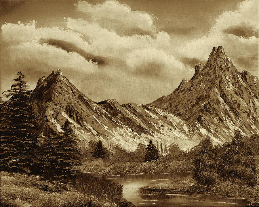
Painting in Moonlight

Our eyes can’t see well in dim light–we don’t see details like blades of grass or cracks in the sidewalk. Be careful when painting from photo reference–photos can see things the eye won’t see.

Color Constancy

As humans, we don’t see color objectively. Our view of color is very subjective, and we use context clues to figure out what color things are in relation to other things

Image result for color constancy

The two squares with the arrows are actually the same color, though they look very different because of what’s around them.

To try to see colors more accurately, isolate them–look through a hole in a card or through a half-clenched fist.

In imaginative painting, you’ll have to learn how to make things look right by understanding the color of the light source and color of the object, and how they interact.

Successive Contrast: When you look at an object of a certain color, your eyes adjust to that color. The resulting afterimage affects what you look at next–this means that a few areas of complementary color can help enliven a color scheme

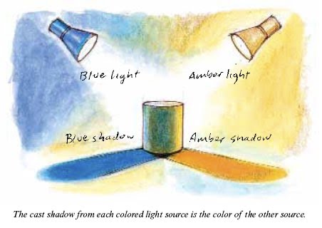
Colored Illumination Effects: Reflected light of a different color (0n shadow side) can make the light side appear a different color. We don’t see colors objectively.

Cool Light, Warm Shadows

Five Factors affect the appearance of colors:

  1. Simultaneous Contrast: Hue/color/saturation/brightness of a background color can induce opposite qualities in an object sitting in front of it.
  2. Successive Contrast: Looking at one color changes the next color we see.
  3. Chromatic Adaptation: Our visual system becomes adjusted to a given color of illumination. When illumination changes in color temperature, the sensitivity of color receptors changes in relative proportion, resulting in a balanced impression of color and light levels.
  4. Color Constancy: Local colors appear consistent, regardless of lighting circumstances that change their hue/color/saturation.
  5. Size of the Object: Smaller objects appear to have less distinct color.

When painting, COMPARE colors to each other to figure out what they should look like. Compare to a white and black, to a same-value gray, and to a full-chroma version of a hue.

CHAPTER 4

So, you think red, yellow, and blue are the primary colors?

Ha.

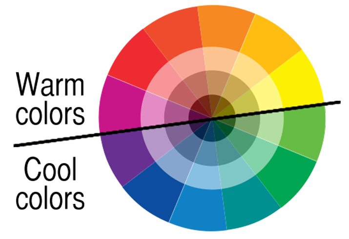
Nothing is as simple as it may at first seem. There are lots of different color wheels, and lots of different theories about color. There is red/green/blue of light, CMYK of printing, and lots of other ideas about what the primaries actually are.

Here’s the Yurmby color wheel

Image result for yurmby color wheel

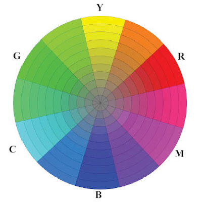
Red Blue and Green are separated by Magenta, Cyan, and Yellow (all are equidistant on the wheel).

Each color is defined by its HUE (where it is around the edge of the color wheel) and its CHROMA (how pure or grayed-out it is).

Peak Chroma Value (see photo above). Yellow is at its highest chroma in lighter colors. Red in the middle values, and blue in the darker.

Local color: Color of the surface of an object as it appears close up in white light. The color you actually mix will usually be different from the local color.

Grays are an artist’s best friend.

“Better gray than garish.” –Dominique Ingres

Try mixing grays from complementary pairs, and use those pairs in the painting as well.

There is no single gray color. Don’t be afraid of grays.

GREEN is a struggle for many artists. It can look weird.

Some tips:

You can get rid of green pigments–make them from mixing blues and yellows. They’ll be weaker and more varied (that’s better).

Avoid monotony–vary your green mixtures.

Use a pink or reddish gray with the greens. “Smuggling reds.”

Prime canvas with pinks/reds so they’ll show through and enliven the greens.

Creating good gradation takes careful color mixing and has a great effect. “Nature will not have one line nor color, nor one portion nor atom of space without a change in it. There is not one of her shadows, tints, or hues that is not in a state of perpetual variation.” — John Ruskin

Here’s some gradation from Ruskin himself:

Image result for john ruskin paintings

Tints–add white to make a pastel colors. Offset these with darker values in other areas of the painting for contrast.

2 ways to make tints: add white (makes it more bluish) or add it in a glaze.

Color and Light: Color Relationships

This post is about chapter six of Color and Light.

Here are all my thoughts and notes and such.

Monochromatic Color Scheme

Composed of any single hue taken through a range of value or chroma.

There’s a tradition for artwork made in grayish, brownish, or bluish tones.

Pencil drawings/anything made with one drawing tool–monochrome.

Grisaille-in gray.  Often used as a preliminary step to plan tonal values before colors were overlaid in glazes. Here’s an example.

Image result for grisaille art definitionImage result for grisaille art definition


Monochrome draws attention–unique, understated. Suggest historical photos or flashbacks.

Image result for sepia painting


Warm and Cool

Idea of warm/cool colors is in our heads, but it has a real effect.

Image result for warm colors vs cool colors

Warms range from yellow-greens to oranges and reds. Cools range from blue-greens to violets.

Cool colors evoke feelings of winter, night, sky, shadow, sleep, and ice.

Blue: quiet, rest, calm.

Warm colors bring feelings of fire, hot spices, blood, energy passion.

Orange and yellow are fleeting colors in nature.

Using all cools in a painting gives a feeling of mystery, darkness, or gloom.

Putting warm color next to cools adds interests.

Warms and cools can complement each other in grayed-down brown and blue-gray palettes.

Colored Light Interactions

Additive color mixing–when two different colors of light shine on a form, creating a new color. It’s the blending of color in the eye.

Mixing two colored lights creates an area with a higher value than either light separately.

Green + Red = Yellow

If you have two light sources of different colors shining on the same form, the cast shadow from each light source will be the color of the other light source.

Image result for complementary shadow color

Triads

triadic scheme is made up of any 3 basic colors (not necessarily full-chroma colors)

To use such a scheme, choose three colors. These are your tools. The colors should show up in different variations throughout the piece. You can put a few touches of other colors in, but try to stick to the three.

Question: I’ve always thought of triads as necessitating 3 colors equidistant on the color wheel, but that’s not what was described in the book… I guess you can do whatever you want, but having colors equidistant on the wheel is visually interesting.

Here’s what I’ve usually seen when talking about triads:

Image result for triad color scheme

Color Accent

Adding a pop of color to a black-and white or gray image creates interest.

A color accent is a small area of color that’s very different from the rest of the piece.

A color accent can create the main focus of interest, but they can also be peppered throughout an image, adding relief from big areas of similar hue.

And that’s it, folks! 🙂

What a cool chapter. I am excited to try out the different techniques and make something awesome.

Color and Light Ch. 2 and more Robh Ruppel

COLOR AND LIGHT

Okay, so, chapter 2 of  Color and Light is awesome. It talks about the different sources of light and how they look and how they affect an image.

Outdoor light consists of 3 kinds. The primary light source is the sun, which is a direct light and casts dark shadows. There is also the more diffused all-over light from the sky, which is bluish. There is also reflected light that bounces up from the ground and has the color of the ground from which it bounced.

When it’s overcast, the light is more diffused, and so colors are actually more distinct and bright, and there are fewer harsh shadows and highlights. It’s the ideal outdoor light for artists and photographers.

Window light is usually bluish, and it creates contrast with warmer electric lights in a room. Sometimes, light is also bounced from the ground outside to the ceiling–it’s often green or orange, depending on the color of the ground from which it bounces.

Image result for window light gurney

Candlelight and firelight are yell0w-orange.

Fall-off: The brightness of any point-source illumination diminishes rapidly with distance, according to the inverse square law–the effect of light shining on a surface weakens at a rate comparable to square of the distance between source and surface. (At twice the distance, the light is 1/4 as bright because rays must cover 4 times the area. At 3 times the distance, the light is 1/9 as bright.)

Light-Fall-Off-between-models

Indoor Electric Light is defined by 3 characteristics: Relative brightness, hardness or softness, and color cast.

Relative Brightness: How bright is one source compared to another? Relative brightness depends on wattage, type of lamp, how close the subject is to the light, and how bright other lights are.

Hardness or Softness: Hard light comes from a sharp, small point, like the sun or a spotlight. It’s directional and dramatic, casting crisp shadows and bringing out surface texture and highlights. Soft light emanates from a wider area. It’s more flattering and reassuring. It’s softer, causes more gradual transitions, and it’s good for task lighting.

Color Cast: Color cast is the dominant wavelength of a light source. Incandescent lights are strongest in oranges and reds, and weak in blues. Fluorescent lights emphasize yellow-green.

Streetlights and night scenes were traditionally lit with two sources–the moon (a blue or gray color) and orange flame-based light. In the modern world, there are more colors. Night scenes look different to the eye than they do to the camera.

To learn about night illumination:

Take photos with a digital camera set on a night setting. Disable the white balance setting and take pictures of a color wheel under different streetlights, then compare the photos to see how the colors are skewed. Try some urban night painting (light your palette with a portable LED light). Collect photos showing cityscapes at night.

Luminescence is the light given off by some objects at cool temperatures. Luminescent colors often graduate from one hue to another. Blue-green colors are most common in the ocean because the wavelengths travel the farthest through the water. Paint a scene in darker tones, then add the luminescence in at the end.

Hidden light sources can add interest. The three ways to light a scene are with a visible light source, a source outside of the frame, or from within the scene, but from  a hidden source. Concealed light sources provide interest. Mixing and matching different light sources (from different locations and with different temperatures) adds interest to a piece.


GRAPHIC L.A.

“Draw now… judge later.” Just go for it. Remember the basic rules of composition. Create bold shapes. Try the 70/30 rule.

Put in the work at the start, and at every stage of the process so that you can create a successful image. (Don’t try to skip to the end, like Prince Humperdink, otherwise things might not go as you had planned.)

Find the 3 main shapes, 3 main values, 3 main levels. Look for the best, simplest arrangement of values and forms.

EXPLORE. Move elements around a bit. Experiment with shape, placement, and all that jazz.

“A curious, less tense mind makes better choices and observations.”