The book Graphic L.A. by Robh Ruppel is, frankly, really cool.
Here are my notes on what I’ve read so far. (p. 5-37, 58-82, 92).
First off, Ruppel says that “Drawing IS symbol making!”
In his work, he started by blocking things out in a a very simple manner, trying to”reduce everything [he] saw into simple geometric shapes and the fewest values.”
According to him, you need to get the right initial tones and colors set down so that you can create an illusion of reality. The shapes can be super simple as long as the values are correct–it will still read as the intended image.
DON’T JUST COPY what you see. Find the right value pattern to represent the scene.
You’re an artist. You’re here to make design choices, not to just copy what’s in front of you.
Use simple shapes: straight lines, s-curves, and c-curves.
Contrast areas of visual rest and visual complexity.
shape/design = large rhythms
form = contours/etching/hatching
Take your time to make thumbnails. The success of your final rendering is conditional upon the amount of work you put in at the sketching phase.
GOOD QUESTION: Is the design interesting and “getable” in two values?
Method for working: Block out lightest light and darkest dark, then work from back to front, getting things right before moving on.
It’s about the larger shapes and design and the idea behind it.
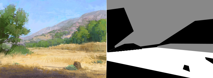
(Look at my own attempt to break down one of Robh Ruppel’s images. The values are really simple.)
Alter the values that you see in life so that the scene becomes easy to read and the focus/intent is clear. That’s all part of the designing process of art. Choose what you want to emphasize, and make your piece say what you want it to, rather than letting yourself get caught up in how the thing really looked or what it’s ‘supposed’ to look like. I think that this shows how important it is to practice A LOT. If you’re practicing, you will have the skill to see how you can change things, and you can make things look convincing and cool without copying exactly what’s in front of your face or in a photograph.
Find/emphasize rhythms… (That helps create some unity in the piece.)
“Everything is an excuse to show depth, overlap, and form.” I like how that sounds, but I’m not quite sure what it means and how to apply it. (Maybe it means that you should show those things as much as you can?)
Complex forms can be described with very simple shapes. How far can you simplify the idea?
Good value design: The clear, simple arrangement of a few tones.
An inspirational quote:
Don’t get hung up on one way to make art. Try out what looks right to you.
REDUCE
REFINE
INTERPRET
reduce to simple, clear geometric shapes and simple clear form (shadows).

